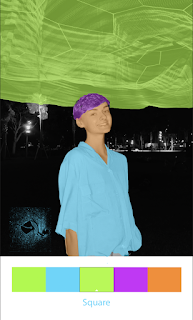
Final Portfolio
For my portfolio I chose to keep a pretty simple theme throughout. On each page I created a red border with two sets of cherries in opposite corners. The cover page includes the title and other relevant information to the portfolio. Then, on the following pages I placed each of my projects with their artist statement. I chose to go with a bold font because I think it makes the text stand out, and it looks pleasing against the simple white background. Finally, the back cover page has the same red border with the cherries, but I placed my logo in the center. I enjoyed making this Portfolio, and I feel that it represents my work over the semester very well!


